
Below is a summary of how the interpolated median (IM), dispersion index (DI) and percent favourable rating (PF) may be used in aggregate reports of SEOI data.
Table 2 shows an example of variability in SEI ratings using data from the UBC Vancouver 2018W (Terms 1 and 2) UMI-5 responses (“The instructor showed concern for student learning”). The columns of data represent different possible ranges of the dispersion index, whilst the rows are possible values of the IM (4.5-5.0 for the top row, 4.0-4.49 for the second and so on). The percentages in brackets are the percent favourable ratings, the percentage of students choosing Agree or Strongly Agree. The colour shading shows different regions of the range of percentage agree values (above 85% dark green, mid green above 65% and so on) as a guide to the eye.
The vast majority of all evaluations fall within IM 3.5-5.0 and a dispersion index somewhere between 0 and 0.55 (the upper 3 rows of the table).
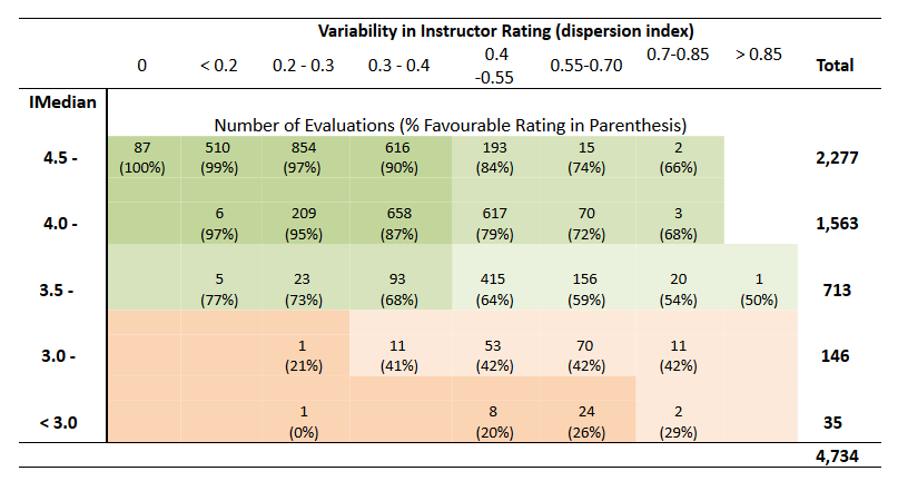
Note that on average, percent favourable rating decreases as dispersion increases in the first three rows (interpolated median of 3.5 or more), but increases with dispersion in the lower two rows (interpolated median less than 3.5). Thus, evaluations in the upper left cells of Table 2 have high ratings, with low variability, resulting in higher percent favourable ratings. Whereas the lower left cells show low ratings, with low variability in students’ scores, resulting in low percent favourable ratings. Furthermore, instructor evaluations in the bottom two rows, corresponding to an interpolated median of less than 3.5, have percent favourable ratings not exceeding 50%.
There is an association between interpolated median and percent favourable ratings. In general, when half the respondents agree (responses of 4 & 5, PF of 50%), the resulting IM is 3.5. Taken together, IM and PF provide a useful visual combination that capture elements of centrality and distribution, as shown in Figure 3 below, which uses all the data from Table 2. The ‘hinge point’ is at IM=3.5 and PF=50%, and no data can fall in the top left or bottom right regions.
There is an association between interpolated median and percent favourable ratings. In general, when half the respondents agree (responses of 4 & 5, PF of 50%), the resulting IM is 3.5. Taken together, IM and PF provide a useful visual combination that captures elements of centrality and distribution, as shown in Figure 3 below, which uses all the data from Table 2. The ‘hinge point’ is at IM=3.5 and PF=50%, and no data can fall in the top left or bottom right regions.1
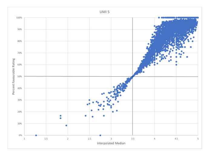
The first three rows of Table 2 correspond to the data points in the upper right quadrant of the graph in Figure 3: when responses indicate PF of 50% or higher, the IM is greater than 3.5. It is worth noting that the vast majority of ratings across courses in this data set are favourable; fully 96% of the 2018W UMI 5 ratings are in the upper right quadrant. A further examination of the ratings in the upper quadrant reveals that almost half of ratings across courses have an IM of 4.5 or greater and an associated PF of 75% or higher.
The bottom two rows in Table 2 correspond to the lower left quadrant in the graph: when responses indicate a PF of less than 50%, the IM is less than 3.5.
Figure 3 presents nearly 5,000 data points for a very large number of courses. Various versions of this graph can be generated to aid in representing and contextualizing student feedback in different subgroups of courses, for different UMI questions, or for a given instructor over time and courses. Figures 4-7 offer examples from both campuses.
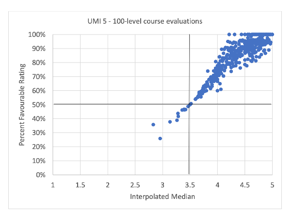
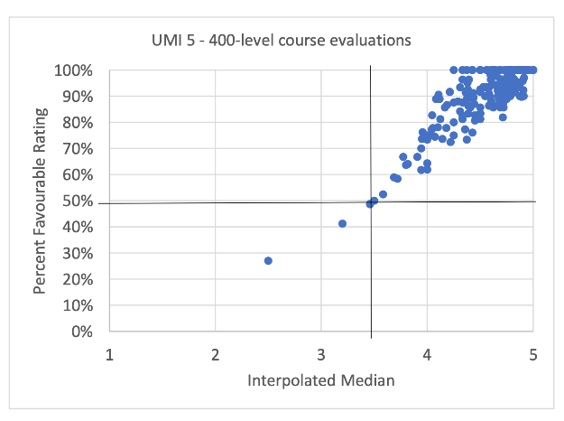
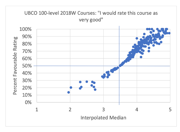
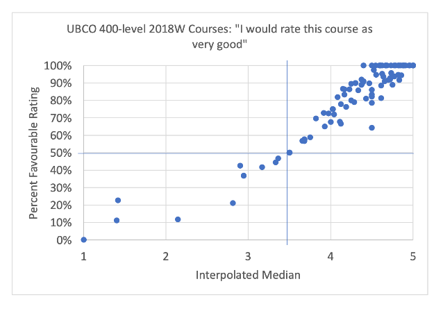
For UBCO, Figure 6 shows 2018W ratings in 100-level courses for the question “I would rate this course as very good,” whereas Figure 7 shows the 400-level courses for the same question.
Requesting reports
Requests by unit Heads, Directors, or Dean’s offices for reports of aggregate data for their department, school, faculty, etc. can be directed to sei.support@ubc.ca. Questions about what kinds of reports are available should be directed there as well.
For those preparing dossiers for reappointment, tenure, or promotion, either individual faculty members or their unit leaders can request that student survey data with the previous metrics be converted to the new metrics for inclusion in candidates files or heads’ letters. Please send requests to sei.support@ubc.ca.
1 Zumrawi, A. A., & Macfadyen, L. P. (2023). Proposed metrics for summarizing student evaluation of teaching data from balanced Likert scale surveys. Cogent Education, 10(2). https://doi.org/10.1080/2331186X.2023.2254665